Details & Summary tags: HTML's best kept secret
posted by Ayush Newatia
8 June, 2021
<details> and <summary> tags are among of the most useful tags that HTML gives us. I’m constantly surprised by how esoteric they are in practice.
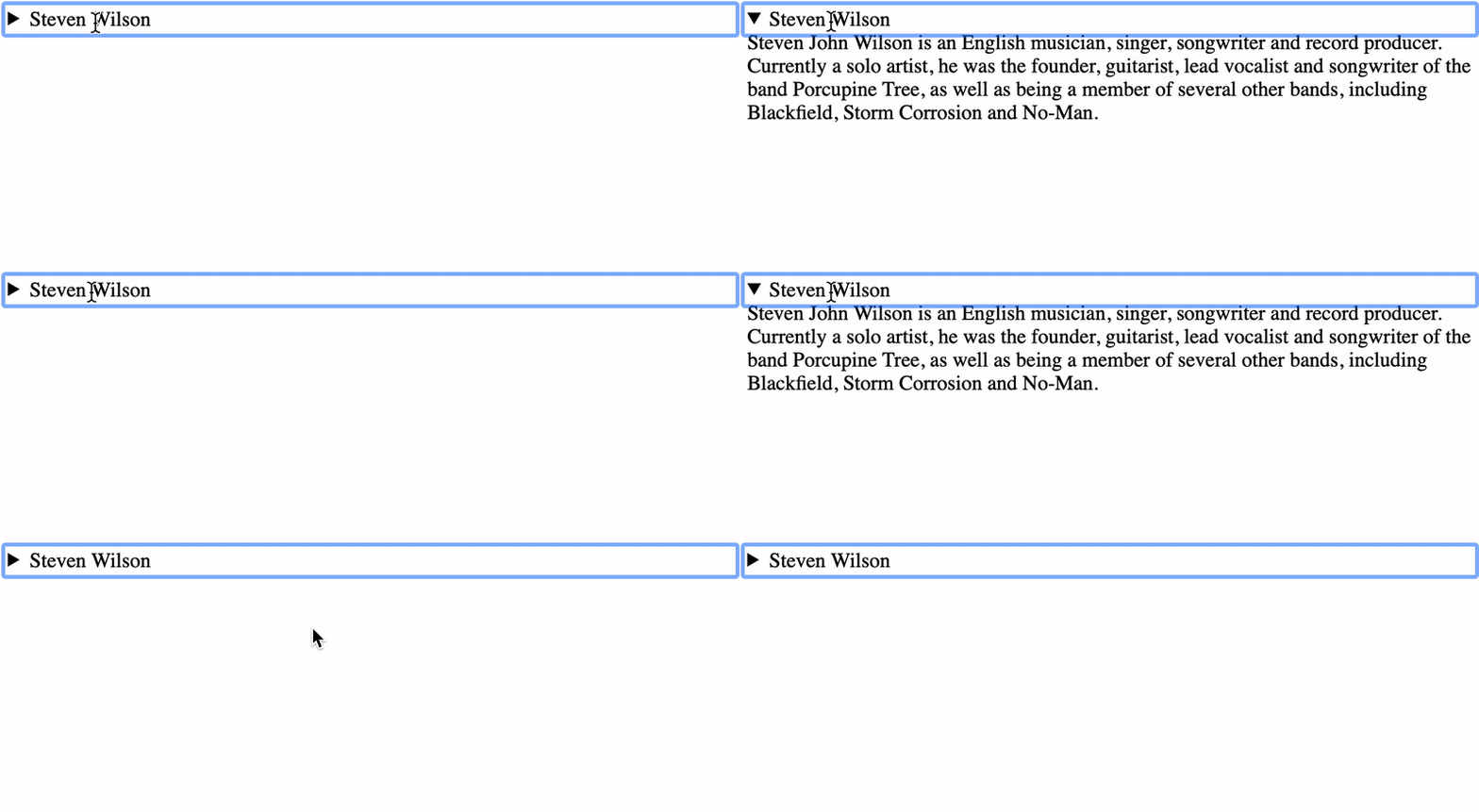
In its simplest use case, the <details> tag gives us an “open/close” toggle control that shows the contents of the <summary> tag when closed; and all its contents when openend by clicking on it.
<details>
  <summary>Steven Wilson</summary>
  Steven John Wilson is an English musician, singer, songwriter and record producer. Currently a solo artist, he was the founder, guitarist, lead vocalist and songwriter of the band Porcupine Tree, as well as being a member of several other bands, including Blackfield, Storm Corrosion and No-Man.
</details>

When the details are open, the <details> tag has an open attribute so we can target some CSS styles on the open attribute to visually change the control’s state:
details[open] {
  background: gray;
}
Here’s a codepen for the above example.
There are a plethora of applications for <details> / <summary> tags such as accordions or dropdowns. You can build these components with these tags without any JavaScript at all!
Let’s take a look at how easy it is to build a dropdown using <details> / <summary>.
Dropdown menu using details / summary tags
The HTML markup for our dropdown is incredibly straightforward. The CSS is where the interesting stuff happens.
This is what the HTML for a simple menu with 3 items would look like:
<details>
  <summary>
    Menu
  </summary>
  <ul>
    <li>Settings</li>
    <li>Profile<li>
    <li>Logout</li>
  </ul>
</details>
To make this into a proper “dropdown” menu we need to alter its behaviour using CSS:
/* Hide arrow glyph */
details > summary {
  list-style: none;
  cursor: pointer;
}

/* Hide arrow glyph in Safari */
details > summary::-webkit-details-marker {
    display: none;
}

/* Set position to relative so we can position */
/* the list of menu items with `absolute` in relation */
/* the `details` tag */
details {
  position: relative;
}

/* Add some styles to make the dropdown menu stand out from */
/* the rest of the page. A high `z-index` ensures it stays */
/* on top of all the other content. */
details ul {
  display: block;
  list-style: none;
  padding: 0;
  border: 2px solid black;
  width: 100px;
  z-index: 100;
  position: absolute;
  background: black;
  color: white;
}
Here’s what the end result looks like:

We have a dropdown with just a few lines of CSS and no JavaScript at all! Here’s a CodePen you can play around with.
The next time you need to build a control with an “open” and “closed” state, reach for <details> / <summary> instead of rolling some custom JavaScript!