The usefulness of Wheaton's Law in product design
posted by Ayush Newatia
21 November, 2020
Software product design these days is becoming more and more driven by metrics. A side effect of that is products are becoming largely homogenous. The recent release of Fleet by Twitter is a case in point. Companies are focused on making some graph or other go higher and higher instead of building cohesive and engaging user experiences.
This obsession with metrics often leads to experiences that are egregiously user hostile. Wheaton’s Law is an implicit or explicit prerequisite for working at most software companies; however very few seem to apply it to their product design as well.
In this post I’m going to particularly call out Amazon, a company that supposedly prides itself on being customer focused. I’m not an Amazon Prime subscriber and Amazon’s checkout flow tries to shove it down my throat at every turn; whether I want it or not.
The Amazon checkout flow
As a non-Prime customer, when I try to checkout, the Amazon put this full page upsell screen in front of me.

In a classic design dark pattern, the option that suits the company is big and bold and the one that suits me is tiny and fades into the background a bit. Also the copy Resume and pay can be easily misconstrued at a glance. Anyway, I click Order without prime and continue.
Next, the final screen with my order summary has yet another banner on the top with another last ditch attempt at selling me Prime.

This one’s a bit out of the way and not too bad, just mildly annoying. But further down the page is what is truly nasty.
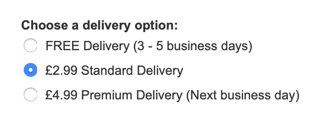
The products I wanted to order had a free delivery option. But because I wasn’t a Prime subscriber, Amazon selects the premium paid options by default.


This is nothing short of entrapment. I’m incredibly fastidious about ordering anything online so I caught these details; but someone else in a bit of a hurry might not and easily end up out of pocket.
This happens every single time I buy something on Amazon.
Why this matters
I know Amazon doesn’t give two shits about some idiot with a laptop having a rant about their checkout flow. But the problem here is people see that Amazon does it and think it’s acceptable for them to do as well. Hence we have a proliferation of dark patterns throughout the web.
What I also don’t understand is why they think this kind of product design helps their cause. Let’s assume someone falls for their trap and unwittingly subscribes to Prime. You can be certain they would be in touch with Customer Support for a refund. Also if they inadvertently end up paying for shipping because it’s selected by default; it’s likely they’d be in touch with support once again.
Amazon being supposedly “customer focused”, will likely issue these refunds. In the end, the dark pattern would have ended up costing them more and would unnecessarily increase the load on their support line. It also leaves a terrible impression on the user who might go elsewhere the next time.
The user experience is always sacrosanct. Treat your user with respect and your graphs will go in the right direction. Treat them with self-serving contempt and you might get some short-term success; but you’ll likely cripple your long term relationship with your customers. Follow Wheaton’s Law in all aspects of your work.